
Main Page
Overview Charts
| Variable | Description |
|---|---|
| Real-time Users | This metric displays the number of users actively using your app at the current moment. It provides immediate feedback on user engagement, allowing you to gauge the impact of new releases or updates in real-time. |
| Average Session Duration | The average session duration is an indicator of how long users typically engage with your app during a single session. This can help you understand if your content or app functionality is resonating with users and keeping them interested. |
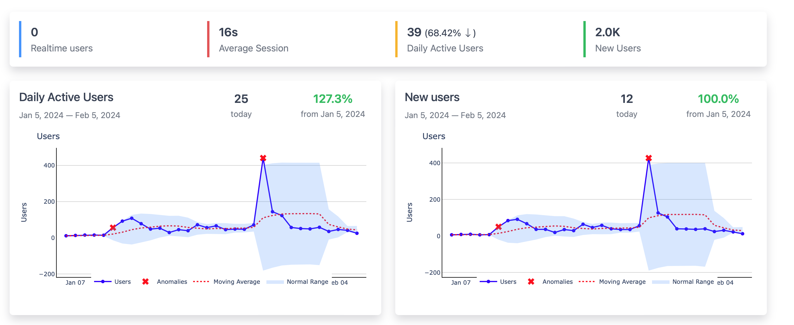
| Daily Active Users (DAU) | This graph shows the number of unique users who interact with your app daily. Tracking DAU helps measure user retention and engagement. A consistent or increasing DAU suggests a healthy, engaging app, while fluctuations might indicate areas needing attention. |
| New Users | The new users chart tracks the number of first-time users of your app. This metric is crucial for assessing the effectiveness of your acquisition strategies and understanding growth patterns. |
| Anomalies | Identified by red stars on the graph, anomalies are automatically detected deviations from normal usage patterns. These can signal critical events such as a viral marketing success or potential issues with app performance. |
| Moving Average | The moving average, shown as a dotted line, helps smooth out the normal day-to-day fluctuations and provides a clearer view of the overall trend in your user metrics. |
| Normal Range | The shaded area represents the normal range of user activity based on historical data. It helps set expectations for typical user activity and can quickly highlight when current data deviates from the norm. |
Traffic Analytics
| Variable | Description |
|---|---|
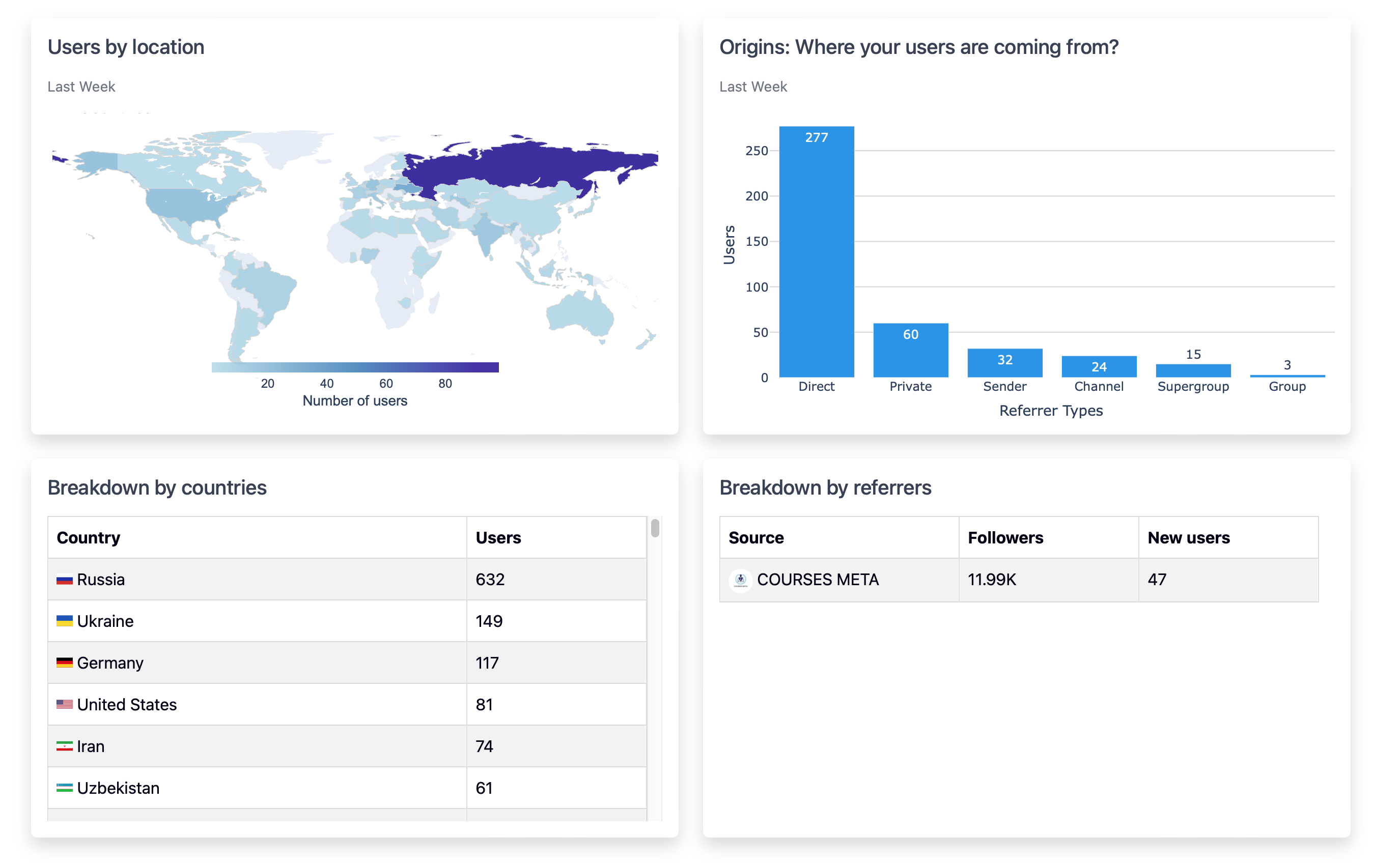
| Users by Location | This map visualizes user distribution across the globe, giving you a quick visual understanding of geographic reach. You can see which countries or regions are the most active in terms of user count, allowing for targeted marketing strategies. |
| Origins | This chart categorizes users based on how they arrive at your app, such as direct entries, private shares, channel referrals, etc. It provides insights into the most effective channels for user acquisition. |
| Breakdown by Countries | A detailed list showing the number of users from specific countries. This data can inform localization efforts and indicate where to allocate resources for regional marketing campaigns. |
| Breakdown by Referrers | This critical feature allows you to see which public channels and chats are driving users to your app without the need for traditional UTM tracking. It's incredibly useful for understanding the organic spread of your app and identifying influential sources of traffic. |
Platform Analytics
| Variable | Description |
|---|---|
| Client Distribution | This bar chart provides a clear visual representation of the distribution of Telegram clients used by your app's users. It compares the usage across different platforms, such as Android, iOS, Desktop, etc., over the last week. This data is essential for understanding which platforms are most popular among your users, guiding you to optimize your app's performance and user experience for those platforms. |
| Device Breakdown | The pie chart breaks down the device types used by your app's users, offering insights into the most popular devices, like Apple iPhone or Samsung Phone. A large slice for 'Other' devices suggests a diverse range of devices that you might want to test your app on. This information is crucial for device-specific optimizations and ensuring a smooth user experience across all popular devices. |
Engagement Analytics
| Variable | Description |
|---|---|
| Session Length Distribution | This bar chart provides an insightful look into how long users are actively engaged with your app during their sessions. The session lengths are categorized into ranges from 0-3 seconds up to 600-1800 seconds, allowing you to quickly assess the depth of engagement among your user base. |
Updated over 1 year ago